Why Mobile-First Design is Critical for Trade Websites
Your customers are searching for tradespeople on their phones, not their computers. If your website isn't mobile-first, you're losing customers before they even call. Here's why mobile design can make or break your trade business.
It's 9 PM on a Tuesday. A homeowner's boiler has just broken down, and they're frantically searching for an emergency plumber on their phone. They find your website, but it's slow to load, hard to navigate, and your phone number is buried somewhere they can't find. They hit the back button and call your competitor instead.
The Mobile Reality for Tradespeople
- • 73% of trade-related searches happen on mobile devices
- • 61% of users won't return to a mobile site they had trouble accessing
- • 40% will visit a competitor's site instead
- • Mobile users are 5x more likely to abandon a task if the site isn't mobile-optimized
What Mobile-First Actually Means
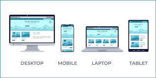
Mobile-first isn't just about making your website "work" on phones. It's about designing the entire experience around mobile users first, then enhancing it for larger screens.
❌ Mobile-Responsive (Old Approach)
- • Design for desktop first
- • Squeeze content to fit mobile
- • Hide elements on smaller screens
- • Often slow and clunky on mobile
- • Mobile feels like an afterthought
✅ Mobile-First (Modern Approach)
- • Design for mobile first
- • Prioritize essential content
- • Add features for larger screens
- • Fast and intuitive on mobile
- • Mobile experience is the priority
Why Trade Customers Are Mobile-First
Understanding when and why customers search for tradespeople on mobile helps explain why mobile-first design is crucial:
Emergency Situations
Common Mobile Search Scenarios
- Burst pipe at 11 PM: Homeowner needs emergency plumber immediately
- Power cut during dinner: Family searching for emergency electrician
- Boiler breakdown in winter: Urgent heating repair needed
- Blocked drain flooding bathroom: Need immediate drainage help
On-the-Go Research
Even for planned work, customers often research tradespeople while:
- Commuting to/from work
- During lunch breaks
- Waiting for appointments
- In the evening while watching TV
Essential Mobile-First Features for Trade Websites
1. One-Tap Calling
Your phone number should be clickable and prominent on every page. When someone taps it, their phone should immediately start dialing.
Phone Number Best Practices
- Sticky header: Phone number always visible as user scrolls
- Large, tappable buttons: Minimum 44px height for easy tapping
- Contrasting colors: Make the call button stand out
- Clear labeling: "Call Now" or "Emergency Callout"
2. Fast Loading Speed
Mobile users expect websites to load in under 3 seconds. Every additional second increases bounce rate by 32%.
Speed Optimization
- • Optimize images for mobile
- • Minimize code and scripts
- • Use fast, reliable hosting
- • Enable browser caching
- • Compress files automatically
Speed Impact
- • 1-3 seconds: Good user experience
- • 3-5 seconds: 32% increase in bounce rate
- • 5-7 seconds: 90% increase in bounce rate
- • 7+ seconds: Most users abandon
3. Thumb-Friendly Navigation
Mobile users navigate with their thumbs. Your website should be designed around natural thumb movements and reach zones.
Mobile Navigation Principles
- Bottom navigation: Important actions within thumb reach
- Large touch targets: Buttons and links easy to tap
- Adequate spacing: Prevent accidental taps
- Simple menu structure: Maximum 5-7 main navigation items
4. Readable Text Without Zooming
If users have to pinch and zoom to read your content, they'll leave. Text should be easily readable on mobile screens.
Mobile Typography Guidelines
Font Sizes
- • Body text: Minimum 16px
- • Headings: 24px or larger
- • Phone numbers: 18px or larger
- • Button text: 16px minimum
Readability
- • High contrast colors
- • Adequate line spacing
- • Short paragraphs
- • Bullet points for lists
Mobile-First Content Strategy
Prioritize Essential Information
Mobile screens have limited space. Lead with what matters most to your customers:
Above the Fold (First Screen)
- • What you do (in simple terms)
- • Where you work (service area)
- • Phone number (large and clickable)
- • Emergency availability (if applicable)
Second Screen
- • Key services offered
- • Trust indicators (certifications, insurance)
- • Customer reviews/testimonials
- • Years in business
Scannable Content Format
Mobile users scan rather than read. Format your content for quick consumption:
❌ Mobile-Unfriendly
- • Long paragraphs
- • Dense blocks of text
- • Complex sentences
- • Technical jargon
- • No visual breaks
✅ Mobile-Friendly
- • Short paragraphs (2-3 sentences)
- • Bullet points and lists
- • Clear headings
- • Simple language
- • Plenty of white space
Mobile SEO Considerations
Google uses mobile-first indexing, meaning it primarily uses the mobile version of your site for ranking and indexing.
Mobile SEO Essentials
- Page speed: Core Web Vitals are ranking factors
- Mobile usability: No mobile usability errors in Search Console
- Local optimization: Mobile searches are often location-based
- Structured data: Help Google understand your business
Testing Your Mobile Experience
Regular testing ensures your mobile experience stays optimal:
Monthly Mobile Checks
- • Test on different devices and screen sizes
- • Check loading speed on mobile networks
- • Verify all buttons and links work properly
- • Ensure forms are easy to complete
- • Test the phone calling functionality
- • Review Google Search Console mobile usability reports
The Mobile-First Advantage
Tradespeople who embrace mobile-first design don't just avoid losing customers—they gain a significant competitive advantage. When your website works perfectly on mobile while your competitors' sites are clunky and slow, the choice is obvious.
Mobile-first isn't just about technology—it's about understanding how your customers behave and meeting them where they are. In an emergency at 11 PM, they're not sitting at a desktop computer. They're on their phone, and they need help now.
Ready to Get Your Professional Website?
Stop losing customers to competitors with better websites. Get a professional trade website that works 24/7 to grow your business and attract quality customers.
Get Your Professional Website